We’re early in the new year, and that means it’s time to speculate on what colours are going to be popular this year! Here in Winnipeg, it’s still a bit too early to tell what exterior colours are going to be popular; after all, you can’t paint very well in -35, which is the temperature with wind chill as I write this. You can paint your home’s interior, though, and we would highly recommend that you do so; painters tend to be more available this time of year, because people are reluctant to remodel in the winter. There are a few trends to look into this year; for those not in the know, it’s often paint producers who set these trends, along with colour match giant Pantone. There are colours of the year and full palettes to be aware of.
PPG Paints gave their colour of the year nod to their paint Night Watch, a rich, natural looking shade of green, close to a hunter green, so named because hunters used to wear it in the wilds, ostensibly for camouflage. This colour encourages you to experiment with natural, woodland inspired palettes, and it’s bold enough to work as an eye-catching accent wall; hunters actually moved away from this colour as time went on because it was too bold. When you’re looking for something eye-catching that is somehow both invigorating and soothing, this is a great colour!
Sherwin-Williams named their Cavern Clay paint colour of the year; it’s a warm terracotta, evocative of deserts and ancient civilizations. The colour is bold enough to work as an accent wall, but pleasant enough to paint a whole room in. It’s both warm and soft, and works well with woods, greenery, black and white/cream colours. The colour, like PPG’s, seems to be evoking a back-to-roots vibe, a trend that seems to continue with the rest of the colours of the year.
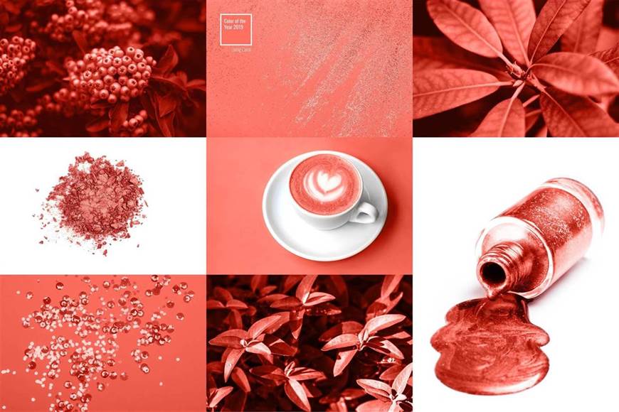
Pantone’s Colour of the Year, Living Coral will be seen not just in interior painting, but in graphic design. Somewhere in the realm between pink and orange, it’s a warm, vibrant colour that isn’t overwhelming; it seeks to emulate the natural look of coral. Pantone themselves describe the color as “lighthearted”, and you can use that playful vibe for an accent wall in your home. That said, the color isn’t overwhelming, so you could use it to paint a whole room.
You might have noticed a trend with these three colours of the year; they’re all both vibrant and relaxing, exuding a warm but not overly exuberant vibe. With colour psychology, you can understand why; the colours all stand out because of their rich tones, but their naturalistic look soothes. This lends them a lot of versatility to be used in an entire room or simply as accents. I’m really excited for a lot of these trends, and you should be too, because one of them will almost certainly suit your project, from bedroom to living room to kitchen. For high quality house painting in 2019, these trends are a great place to start!


