Painters Winnipeg | Madani Group Painting And Stucco Coating
  • Home
  • About Us
  • Estimate
  • Service
    • Stucco Painting
    • Exterior Painting
    • Stucco Repairs
    • Commercial Painting
    • Interior Painting
  • Gallery
  • Contact
  • Blog
ARTICLES & RESOURCES
Our Blog Posts

The Exterior World

2/6/2019

 
Picture


​


By the time you read this blog, it will be February. January certainly came in with a whimper and left with a cold bang, as I’m writing this, it’s about -40 outside, and moisture is turning to ice almost instantly. This isn’t necessarily the time of year when most people are thinking of how to get the
best exterior painting done, but there are a few principles that are worth talking about that relate back to the cold weather; things you should know about building materials, and how moisture and expansion can affect them over time.


Think about concrete, an extremely popular building material, and one that is commonly used in commercial and industrial buildings, if not so common on your home’s exterior. Most of the time, when you see concrete, it’s in a fairly raw state. That’s actually quite dangerous in Winnipeg winters, because uncoated concrete can be quite porous, so water gets into the concrete. When winter comes around, that water freezes and expands, and the pressure can cause the concrete to crack. This same principle is why we see so many potholes in our roads come spring, and why our old brutalist buildings tend to be in such disrepair. One of the advantages of paint, especially elastomeric paints, is that they add a level of impermeability to the materials onto which they are painted; concrete paints don’t just make concrete look better, they also make it more durable.

Bricks, which you’ll much more commonly see in home construction, are also quite porous. People can be a bit hesitant to paint their bricks, because the look of brick is so beautiful; I’d be remiss to disagree, brick can look incredible. Fortunately, you can paint your brick with a clear coating, so the brick still looks incredible, but water can’t permeate the surface, so you don’t end up with cracked bricks once winter ends. There are also examples of beautiful brick houses that have been painted; sometimes red, to keep with the brick theme, but sometimes deep blues or vivid purples, to add a funky aesthetic to what is mostly seen as a rustic look.

There are also exterior structures you might not have even thought to paint to protect. Wood is porous, of course; when’s the last time you painted your wooden fence? The same goes for old wood gazebos; they can sometimes be neglected when you’re thinking of painting your home, but without maintenance, you’ll find your gazebo investment has gone to waste. There’s also the soffit and fascia to paint; most folks don’t even know what those are (they’re near your eavestroughs), but painting them to reduce their permeability is incredibly important, because eavestroughs carry a lot of moisture in them.

Painting your home’s exterior isn’t just about creating a beautiful aesthetic; it’s about protecting your most valuable asset. Take the time to find colours that suit you, and hire professional painters to make sure the job is done right, and you’ll be sure to be happy with your decision. Just make sure not to try to get it done in -40!



Read More

The Trend Cycle

1/30/2019

 
Picture

We spent the last two blogs looking at the colours of the year, many of which I absolutely love. What the colours of the year amount to, though, is trend-setting...or is it? Trends are a strange thing, and it’s hard to know when someone is establishing a trend, guessing at a trend, or riding a trend’s coattails. Trends can be seen in two similar lights; they are either a general change in how people are acting, or a new development in fashion, design, music or other aesthetic practices. When considering trends, then, it’s important to consider the relation between the two types; our aesthetic preferences may change depending on general changes to how we act.

Take the colours of the year, for example. They all have one thing in common, except perhaps for Metropolitan: they are meant to soothe, relax, take you back to nature. We know that many of the colours of the year are selected through expert panels who evaluate what colours they think will reflect our aesthetic tastes in the coming year. This must in some ways evaluate the first definition of trend; first, the companies evaluate how they think we’ll want to feel, what vibe we’ll want to emanate. Colour psychology plays an important role in selecting a colour of the year, so human psychology must as well. In 2019, then, the experts think we’ll all want to calm down, and maybe to invigorate ourselves a bit, so we get Living Coral.

When Pantone releases their colour of the year, people scramble to create collaborations, incorporate the colour into their designs; the colour is adopted very quickly. There’s an argument to be made, then, that the colours of the year aren’t predicting trends, they’re setting them. When we see these colours all of the place, is it possible that it will influence our behaviour, our feelings, our trends? Should that be the case, one could argue that by choosing colours of the year, colour creators aren’t only setting aesthetic trends, they’re actually setting up emotional expectations for the year to come. Fortunately, the expert panels tend to choose colours with very positive descriptions; no one wants to buy colours that will make them feel sad all year round. Perhaps, then, incorporating the colours of the year can actually make our world a better place?

Then again, this might all be thinking too much about it. We all want to trend in a positive direction, but aesthetic trends come and go. The colours of the year this year might all go down as quite classic; I can see them being used in a lot of settings, because “calming” generally means the colour will play well with others. When looking at the colour schemes in your home, great Winnipeg painting companies will be able to tell when something is just a trend, and when something is going to be classic. There’s a lot of potentially classic looks this year, so you’ll almost certainly be able to find something from one of the colours that will suit your home for years to come.  

​

Read More

Colour Trends in 2019, Part II

1/23/2019

 
Picture

​There’s so much colour in the world! Too much, in fact, to cover all of the colours of the year we wanted to touch on in just one blog post. In our last post, we covered some of the warmer colours, including Pantone’s Living Coral. Today, we’re going to look at the colours of the year from three different paint companies. In our next blog post, we’re going to touch on trends, and discuss where they stem from, and where they go to. Now, onto the colours!

Benjamin Moore’s colour of the year is Metropolitan, a gray with cool undertones. The choice of a gray as colour of the year is pretty interesting; it strikes me as simultaneously uninspired and daring. Gray is a mainstay of modern interior painting, because it’s so incredibly versatile, and Metropolitan is no exception. You can use it to paint a whole master bedroom, you could use it on trim, and you complement it with deep blues and greens or creams. The reason it strikes me as a bold choice is that most other colours of the year are somewhat striking, while Metropolitan has a subtle elegance about it. The reason it strikes me as uninspired is, well, it’s gray, and gray will be the actual colour of the year for years to come; people love grays.

I particularly love Behr’s colour of the year, a deep, soothing blue with a hint of green called “Blueprint”. Like all of the other colours we’ve seen so far this year, Blueprint is incredibly versatile; you can use it to accent, or to paint a whole room. The colour is at beautiful middle ground for playing with palettes; it’s as well suited to a room with navy blues as it is to a room with pastel pinks. The colour feels incredibly natural and relaxing, in some ways a blue sibling to another colour we’ve seen given the COTY title, Night Watch.

Here’s an interesting fact you may not know; Dulux Paints Colour of the Year is also Night Watch. Why do they have the same favorite colour this year as PPG? Well, as it turns out, PPG bought Dulux’s paint business in the United States. That’s why you end up with two paint companies having the same favorite colour this year, an interesting aside I thought some readers would enjoy!

Now that we’ve looked at all of the colours of the year, what can we learn from the present trends? I think that the answer lies in calm, soothing colours; our warm and cool colours this year are all soothing, even when they’re invigorating, calming even when they catch the eye. This may be because we’re living in a particularly turbulent time, so colours that bring us back to nature and relax us can have a positive effect on our psyche. When our collective psyches are influenced in this way, can it bring about social change? That’s not for me to say, but I do know this: whatever colour you choose, experienced Winnipeg painters are at the ready to make your home look beautiful.


Read More

Winter Renovation

1/16/2019

 
Picture
Winter in Winnipeg, a time of season where all but the bravest among us stay inside and do as little as possible. For the winter sports lovers out there, I’m with you up to about -15, and after that, I’d rather stay in. While the winter might carry with it a lot of disincentives to take action, there’s a few things you should know that might make winter renovation a little bit more appealing.

Let’s start with the exterior. The best exterior painting cannot happen in the wintertime; in fact, it’s actually impossible to paint in the winter. Painters don’t want to be outside in -40 any more than you do, so they’d avoid painting outside at this time of season, even if they could. They can’t, however, because paint is not made to be applied in such cold conditions; it won’t adhere properly, it will be far too solid, and it will give you an all-around bad paint job. When you’re looking to have your home’s exterior painted, do it in the spring or summer; paint is very weather sensitive.

When it comes to interior painting, though, winter is a great time to have it done. This is a slow season for painting, so painters will be far more available than they would be in the summertime. That means it will be easier to create a schedule that you can work with. Your interior is temperature controlled, so applying the paints is no extra trouble. The year’s newest colour trends are fresh, too, so you can be on the bleeding edge of what’s stylish in 2019.

Renovations generally entail more than just painting, and there’s actually dual incentive for doing a whole renovation in the winter time. Contractors, like painters, are usually far more available during the slower winter months, and that can mean not only availability but discounted rates. That means you won’t just be getting a more flexible schedule than might be available in the summer months, you’re also renovating for cheaper; labour costs are a huge portion of your overall renovation expenses, so it’s worth looking into. In January and February, many companies are also holding clearance sales to get rid of last year’s stock, so you can find some pretty incredible deals on things like cabinets and countertops.

The biggest disincentive to renovating in the wintertime is that you’ll be in your home a lot while the renovations are occuring. This can be especially problematic if you have small children, so winter renovations aren’t necessarily for everyone. That said, if the house is all adults, it can be a good excuse to go explore Winnipeg in the winter, visiting the restaurants, skating trails, festivals; whatever you like! When you create your renovation schedule, plan times away from your home at the same time, book reservations, and go enjoy; renovate your mind while contractors renovate your home, and by winter’s end you’ll be luxuriating in your new space!

​
Read More

Colour Trends to Watch in 2019

1/9/2019

 
Picture
We’re early in the new year, and that means it’s time to speculate on what colours are going to be popular this year! Here in Winnipeg, it’s still a bit too early to tell what exterior colours are going to be popular; after all, you can’t paint very well in -35, which is the temperature with wind chill as I write this. You can paint your home’s interior, though, and we would highly recommend that you do so; painters tend to be more available this time of year, because people are reluctant to remodel in the winter. There are a few trends to look into this year; for those not in the know, it’s often paint producers who set these trends, along with colour match giant Pantone. There are colours of the year and full palettes to be aware of.

PPG Paints gave their colour of the year nod to their paint Night Watch, a rich, natural looking shade of green, close to a hunter green, so named because hunters used to wear it in the wilds, ostensibly for camouflage. This colour encourages you to experiment with natural, woodland inspired palettes, and it’s bold enough to work as an eye-catching accent wall; hunters actually moved away from this colour as time went on because it was too bold. When you’re looking for something eye-catching that is somehow both invigorating and soothing, this is a great colour!

Sherwin-Williams named their Cavern Clay paint colour of the year; it’s a warm terracotta, evocative of deserts and ancient civilizations. The colour is bold enough to work as an accent wall, but pleasant enough to paint a whole room in. It’s both warm and soft, and works well with woods, greenery, black and white/cream colours. The colour, like PPG’s, seems to be evoking a back-to-roots vibe, a trend that seems to continue with the rest of the colours of the year.

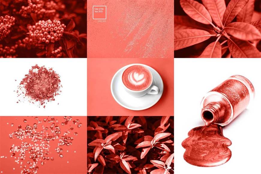
Pantone’s Colour of the Year, Living Coral will be seen not just in interior painting, but in graphic design. Somewhere in the realm between pink and orange, it’s a warm, vibrant colour that isn’t overwhelming; it seeks to emulate the natural look of coral. Pantone themselves describe the color as “lighthearted”, and you can use that playful vibe for an accent wall in your home. That said, the color isn’t overwhelming, so you could use it to paint a whole room.

You might have noticed a trend with these three colours of the year; they’re all both vibrant and relaxing, exuding a warm but not overly exuberant vibe. With colour psychology, you can understand why; the colours all stand out because of their rich tones, but their naturalistic look soothes. This lends them a lot of versatility to be used in an entire room or simply as accents. I’m really excited for a lot of these trends, and you should be too, because one of them will almost certainly suit your project, from bedroom to living room to kitchen. For high quality house painting in 2019, these trends are a great place to start!

​
Read More

Painting Your Cabinets

1/2/2019

 
Picture

​


There’s a lot of things you can paint in your house; your typical interior full-house painting will include the walls, the trim, and maybe even the ceiling. You can create accent walls, you can do multichromatic schemes; the possibilities are almost endless. Sometimes, though, you want to make a splash without redoing the whole house; you want to add some interest to a room while maintaining the overall colour scheme. In your kitchen, a perfect candidate for that kind of job is your cabinets; they can create a wonderful accent that brings out the colours of the room and draws people’s eyes. There’s a lot of work that goes into a good cabinet painting; we’re going to tell you how we do it.
 
The first thing we do anytime we paint is always the same: assess what kind of prepwork needs to be done. Kitchen cabinets suffer the brunt of spilled sauces and grease spittle, so they’ll need to be cleaned. To do a thorough cleaning, we’ll need to remove the cabinet doors from their hinges, so we can clean off both sides. Not only does this help us clean off the doors, it also lets us to a more precise paint job; you don’t want the interior of your cabinet door looking markedly different from the exterior. We’ll also prep all the surfaces in your kitchen so that paint splatter won’t hit anything else; painting is all about the prepwork!
 
Once that’s all done, we can get down to painting. Most cabinet doors are wooden, so they’ll need a good sanding before we can actually paint them, then it’s a matter of what kind of paint you want. A lot of folks want to let the grain of their wood shine through; in these cases, a good wood stain will impart beautiful colour onto the wood while still maintaining it’s natural look. Wood stains are pretty interesting, because they come in a variety of colours; most folks opt for colours you might actually see in wood, like pine or redwood, but you can get really funky with wood stains and opt for blues, purples, and all other manner of colour!
 
You can also opt to use a solid colour paint if you don’t want the texture of the wood to show; that opens up a wide array of possibilities you might not find in wood staining. We’ll evaluate the type of paint or stain you had on the cabinets prior to the repaint, and propose what the best solution for a new paint job might be. No matter which way you go, in the end, you’ll love your new cabinets.
 
Great Winnipeg painting companies can ensure the highest quality cabinet painting, so the only thing that’s left is for you to choose how you want them painted! Take a look at this list of beautiful cabinets for inspiration, and if you’re not sure what you want, we can help you with a colour consultation to make sure the cabinets vibe with the rest of the kitchen!

Read More

Painting Your Ceiling

12/27/2018

 
Picture


​We like to talk about how important it is to have a roof over your head, but I feel like we might be better off talking about a ceiling over our heads; after all, that’s what we look up at most of the time. Given this, the ceiling is somewhat neglected in the overall home aesthetic; how often do you clean your ceiling? Admittedly, the ceiling undergoes a lot less wear and tear than the rest of the house, but having an aesthetically pleasing ceiling is definitely an important part of having an aesthetically pleasing home. You want to paint your ceiling, but what’s involved?
 
Well, the first thing you have to consider when painting a ceiling is gravity. Paint, as you know, is pretty liquid, and if you’re putting a particularly watered-down paint on the ceiling, you can expect a lot of it to end up on your floor, or the faces of the people painting. That’s why there’s specially formulated ceiling paints with high viscosity; experienced Winnipeg painters will use these paints to avoid making a mess in your house!
 
A lot of people will want to paint their ceilings, but worry because they have old stipple or popcorn ceilings that have undergone damage or wear. With Madani Group, you have access to professional stipple and popcorn ceiling repair services, so we can have the textures in your ceiling looking incredible before we paint them in any colours you might want!
 
“Any colour I want”, you might be thinking, “but wouldn’t I just want white”? Well, dear reader, let me tell you: you might want white, but you can have so much more. Your ceiling can act as a brilliant pseudo-accent wall in whatever room you like. You can have a navy blue ceiling, or a bright orange ceiling; anything your heart desires! Figure out the overall colour scheme of the room and create a ceiling accent; you’ll be pleasantly surprised at the amazing effect it creates! One of my friends, the mother of a young boy, painted her son’s ceiling a midnight blue, then painted glow-in-the-dark stars on the ceiling, to create a night sky every time he goes to sleep! Definitely one of the cuter projects I’ve ever heard of.
 
You might be a bit unsure as to whether or not you should paint your ceiling a non-white colour; white is totally fine, but if you’re looking for inspiration, check out this article of 5 beautifully painted ceilings. Whether or not you’re going for a colourful ceiling look, if it’s been awhile since your ceiling was painted and you’re starting to see the effects of wear, it’s probably time to paint it again. Remember, paint isn’t just aesthetically pleasing; it acts to protect surfaces from the elements. You’ve worked hard to get a ceiling over your head, so don’t neglect it; it keeps your head dry, so keep it looking beautiful! 

Read More

Choosing Interior Paint Colours

12/20/2018

 
Picture


​There’s an interesting phenomenon in psychology called decision paralysis. When my friends and I go to restaurants, we like to point it out to each other when menus are overlong. If you’re a restauranteur, don’t pile items onto your menu, please! It signals two things to the astute diner: there’s no way you can cook 100 quality items fresh, and you don’t understand how overwhelming it can be for a diner to look through 100 items. We like to think more choice is better, but it can actually overload our capacity to make reasonable decisions. That’s what it can feel like when you’re choosing interior paints; so many colours, so many rooms, how to decide?
 
Well, the first thing to do is narrow down what colours you actually want to use. You can select your favorite colours to decorate your rooms, and if you want to narrow it down, you can use our two-part guide to colour psychology to find out which colours best suit a particular room; for a brief overview, bathrooms and bedrooms should be in softer, calming colours while kitchens and dining rooms should be brighter, hunger-inducing colours.
 
When you’re painting a room that already has quite a few furnishings, you can use colour theory to help guide you. You’ll find a primary colour, a secondary colour, and maybe an accent colour; no more than three should be used, and you’ll usually be fine with two colours. You might not know a lot about colour theory, but that’s okay; there’s plenty of online tools to help you find the perfect colour match. Check out our guide to choosing a palette for a list of some of our favorite tools!
 
The other way to get yourself out of the decision rut is to look for inspiration; you can find it in pretty much anything! Look at a bold print you have, for example; if you want a really bright colored room, take from the bright colours in the print and accent with the subtler colours; for a toned-down room, do the opposite! You can also take inspiration from the colour schemes of other homes; there’s so many home improvement blogs online, you’re sure to be able to find something that catches your eye and inspires you. Two other places you can find inspiration: in artists, and outside. Look at a painting in your home and draw from the colours in it; artists understand colour theory like almost no one else. The only person they’re second to is Mother Nature, which is why drawing from natural colour schemes is such a great idea!
 
If after all of this, you’ve narrowed down your selection but still can’t decide, not to worry! The high-quality house painting provided by Madani Group can come with a colour consultation, so we’ll help you pick out of the options you’ve narrowed down using our years of painting experience! We’ll help you avoid what’s just trendy right now, so you can get stylish colour that stands the test of time. You’re in good hands! 

Read More

Big Impact for Few Dollars: Trim and Accents

12/13/2018

 
Picture


​


​Life is always on a budget; sometimes, when we’re in a great financial situation, that budget can be big, but oftentimes, especially around the holidays, it can be stretched pretty thin. That said, when you’re looking around your home, the place that’s supposed to be your sanctuary, and you feel bored, it’s probably best to do something. Your home’s interior affects your overall psychology; if you don’t want to enter your house because it’s too drab, there are options for freshening up, even on a tight budget.
 
Your front door is the number one item to paint to create a bit of dynamism in your home. The front door plays an important role in the mental effect your home has on the people who enter it; a black door might invite notions of formality or power, while a bright red door looks casual and inviting. The paint on your front door and the trim surrounding it will fade over time, so freshen it with a new coat, or choose a new color altogether! Contrast is worth considering here; having a front door that contrasts with the rest of your home’s exterior makes it easier to find, and creates an interesting focal point for your home.
 
Creating an accent wall is another awesome way of adding interest and contrast in your home. Choose a room that’s already painted in neutral tones and decide on a focal point for the area; it might be where your TV or fireplace is, or a particularly interesting painting. Anywhere you want to draw attention is fine, because that’s what your accent wall will do; pick a color that pops, and paint away! This can be a handy tool if you’re like me and have a favorite color that doesn’t suit a whole room, but that you’d like to incorporate in some way. (For those wondering, I like deep shades of purple).
 
Finally, you can add a lot of interest to your home by freshening up the trim and windows, both inside and out. These are particularly nice to tune up because they’re relatively small, so you can use contrasting colors without overwhelming the rest of the home; nice neutrals work amazingly for trim as well. If your trim is looking grim, a fresh coat could be just what you need to liven up the house, even if you stick with creams, greys or other common trim colors.
 
The main advantage of all of these areas is that they’re relatively small; experienced Winnipeg painters can get all of them done in a snap, so the labour and paint costs will be relatively low. Once it’s done, you’ll have a pop of cheer every time you look at your front door, and a feeling of calm every time you look out the window. Your happiness is worth the effort, so don’t let drab colours and fading paint get you down; get a low-cost touch-up done, conserve your budget, and feel great! 

Read More
<<Previous
Forward>>
Powered by Create your own unique website with customizable templates.